
ncWMS Quickstart
ncWMS is a Web Map Service which allows the fast visualisation of data from NetCDF files and other sources of environmental data. This quickstart guide describes how to explore the sample data provided using the Godiva2 web client. For configuration and adding other data sources to the server, please consult the documentation on the ncWMS website.
Start ncWMS
- Select
- After a few moments the application will start up and open a web browser at http://localhost:8080/ncWMS/godiva2.html

Basic usage
Use the left-hand menu to choose a dataset to view. Clicking a dataset (or the + icon to the left of it) will expand the dataset to show the available variables to plot. Choose a variable by clicking on it. The data should appear on the interactive map after a short delay (a progress bar may appear showing the progress of loading image tiles from the WMS server(s)).
Selecting the vertical level
If the variable you are viewing has a vertical dimension you will be able to select the vertical level using the drop-down box above the map.
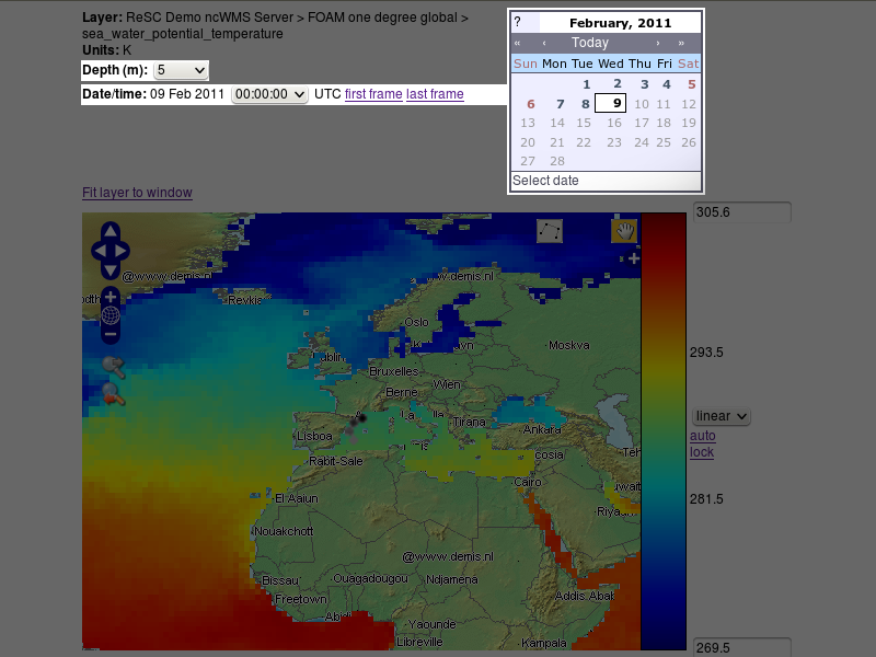
Selecting the timestep
If the displayed variable has a time dimension a calendar control will appear above the map. Click on this control to select the date you wish to focus on. If there are several timesteps available for this day, use the drop-down box above the map to select the time. See below for instructions on creating animations and timeseries plots.
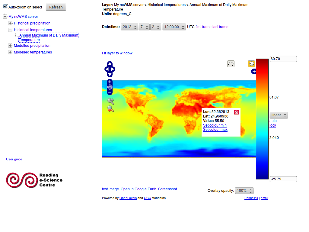
Finding the data value at a point
Once a variable has been displayed on the map, you can click on the map to discover the data value at that point. The data value, along with the latitude and longitude of the point you clicked, will appear in a small pop-up window at the point where you clicked.
Changing the style of the data display
Adjusting the colour contrast range
When you first load up a variable it will appear with a default colour scale range. This range may not be appropriate for the geographical region and timestep you are interested in. By clicking “auto” (to the right of the colour scale bar) the colour scale range will be automatically stretched to suit the data currently displayed in the map. You can also manually change the colour scale range by editing the values at the top and bottom of the colour scale bar. A third way to adjust the colour scale range is to click on the map at any point. The small pop-up window contains links (“Set colour max” and “Set colour min”) that you can click to set the upper or lower extreme of the colour scale to the data value at that point.
Locking the scale range
Sometimes, when comparing two datasets, you might want to fix the colour scale range so that when you select a new variable, that variable is shaded with exactly the same colour scale. To do this, click the “lock” link, which is to the right of the colour scale bar. The colour scale range will then not be changed when a new variable is loaded and the scale range cannot be edited manually. However, the colour palette and the number of colour bands can still be modified while the scale range is locked. Click “unlock” to make the colour scale editable again.
Changing the colour palette
The colour palette can be changed by clicking on the colour scale bar. A pop-up window will appear with the available palettes. Click on one to load the new palette. The window also contains a drop-down box to select the number of colour bands to use, from 10 (giving a contoured appearance) to 253 (smoothed). Note that if the number of colour bands is changed, you will need to click on the desired palette to effect the change.
Other parameters
Certain variables, particularly biological parameters, are best displayed with a logarithmic colour scale. The spacing of the colour scale can be toggled between linear and logarithmic using the drop-down box to the right of the colour scale bar. Note that you cannot select a logarithmic scale if the colour scale range contains negative or zero values.
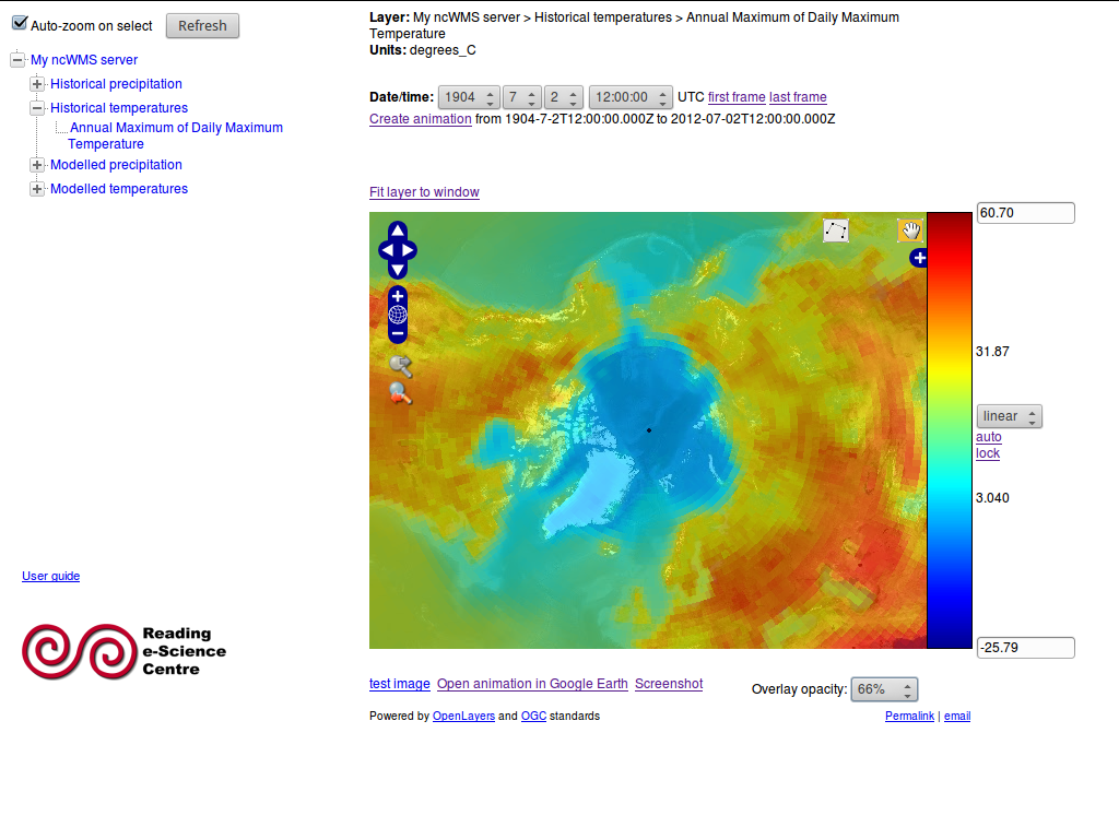
Creating animations
- Select the first timestep for your animation using the calendar control as described above.
- Click “first frame” (above the map).
- Select the last timestep for your animation.
- Click “last frame”.
- Click “Create animation”. Note that the animation may take quite a while to appear.
- Click “Stop animation” (above the map) to stop the animation and return the controls to normal.
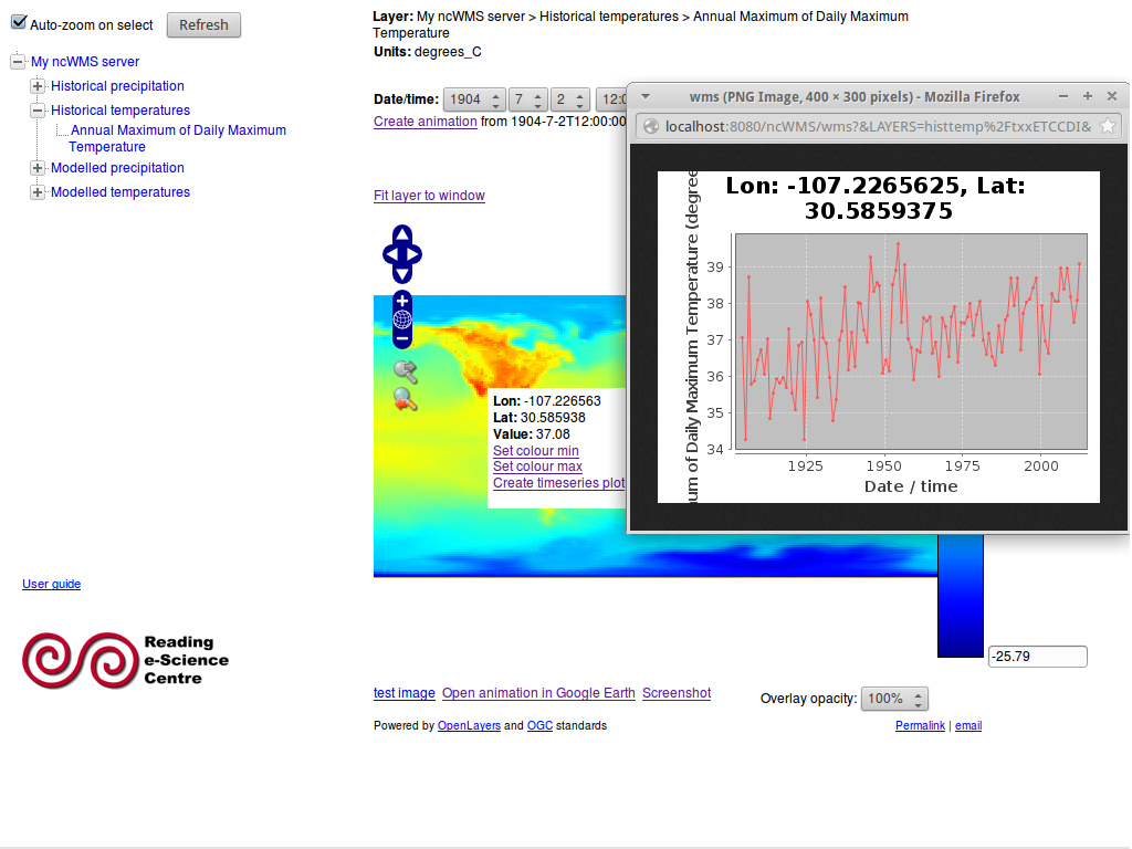
Timeseries plots
Follow steps 1. to 4. in “Creating animations” above. Then click on the map to select a data point and bring up the small pop-up, which will have a link “Create timeseries plot”. Click this to bring up a pop-up window displaying a timeseries of the data value at the selected point over the selected time range.
Vertical sections and transects along arbitrary paths
At the top of the map itself, select the icon that looks like a line joining four points. Click on the map to start drawing a line. Add “waypoints” along this line by single-clicking at each point. Double-click to finish the line. A pop-up will appear showing the variation of the viewed variable along the line (i.e. a transect plot). If the variable has a vertical dimension, a vertical section plot will appear under the transect plot.
Changing the background map
A selection of background maps is available on which data can be projected. Select a different background map by clicking the small plus sign in the top right-hand corner of the interactive map.
Changing the map projection
The map projection is changed by selecting a new background map as above. If the background map is in a different projection then the data overlay will be automatically reprojected into the new coordinate system. Godiva2 provides the option to select a background map in north or south polar stereographic projection. There may be a delay before the map appears in the new projection.
Saving and emailing the view
You may wish to save the current view to return to it later or share it with a colleague. The “Permalink” under the bottom right-hand corner of the map links to a complete URL that, when loaded, recreates the current view. Left-click on the permalink to bring up a new window with an identical view. Right-click on the permalink and select “Copy link location” or the equivalent for your web browser. You can then paste the link into a report, your notes or an email. You can also click on “email” (next to the permalink) to start a new email message in your default email client with the permalink already included in the message body.